


Project: West Lotus
West Lotus is a streetwear brand that explores the Asian-American experience. Through vigorous research, our two-person design team (Janelle Tecson and myself) find the aesthetic intersections of American and Asian cultures, creating custom artworks that reflect the unique feeling of belonging to two cultures but never quite fitting into either. Our clothing is released in drops, each of which focuses on a specific culture within Asia. Visit our online store here.
Creating the Brand
01
When I joined the West Lotus team, all they had was the brand name. It was my job to turn that name into a visual language, core theme, and drop formula. That journey began with the logo...


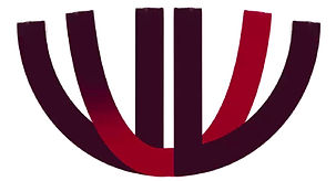
I: Original Sketch
My first concept was simple: take the
'W' and 'L' glyphs and turn them into a lotus. This concept would survive until the end.
II: Cleaning Up
Feeling strongly about the WL lotus concept, I cleaned up the artwork. I also solved the issue of the middle leaves with a colored swoop that would weave through the center and outer leaves.
III: Gradient
In order to push the asymmetry further and make the letters more distinguishable, I applied a gradient to the colored swoop. The 'W' became more clear as a result, though the 'L' still looked too much like a 'V.'


IV: Tapering
This iteration lowered the outermost leaves, allowing the logo to more closely resemble a lotus while solving the issue of the 'L' looking like a 'V.' However, the tops of the leaves still lacked uniformity.
V: Veering Clinical
This iteration served as the logical conclusion of this line of development, solving most of the issues of prior versions. However, it felt too clinical upon further reflection. It was more suited to sportswear apparel than streetwear. I needed to incorporate a more rugged and eastern style. This realization would result in the logo we ultimately decided on.

We decided on Metropolis as our primary typeface. On top of being free for commercial use, the typeface is both modern and understated. Going forward, that simplicity would allow us to get creative with text effects in the apparel artworks, though we decided not to pair the regular typeface with the logo, since it clashed with the more rugged versions in the art. Pairing a rugged version with the logo also caused a clash, where both elements were fighting for visual dominance.
Mongolia Drop
02
West Lotus' creator, Khuslen Misheel, was born and raised in Mongolia. Thus, Mongolia was a fitting first choice for our team to explore. Using his knowledge of Mongolian culture as our reference, we went to work crafting a series of designs that culminated in a final illustration.


Cross-Cultural Iconography
Our concept for Mongolia centered around the eagle and the red/blue/white palette. In the Venn-diagram of the countries' cultural symbolism, these were the concepts in the center that piqued our interest.

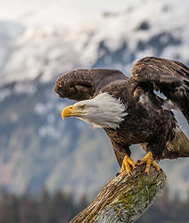
Eagles
One of Mongolia's cultural staples is its use of hunting eagles. These eagles are used by horseback riders to catch prey in the country's desert expanses. From an form perspective, these eagles can best be differentiated from their American cousins through the caps they wear, known as the 'tomaga' or 'tomog.'
Colors
Though the Mongolian flag doesn't include white, red and blue are very important to the culture. They symbolize eternity and the blue sky, tying nicely into the eagle iconography.

India Drop
03
As an Indian-American, the following design was primarily led by me. From the outset, I knew this task would be difficult. India, like any country, contains multitudes. It can't be neatly packaged into an illustration, and the wrong step could anger entire ethnic groups. Ultimately, we chose to center on something that could unite all: revolution.


Revolutionary Themes
India and the US were both British colonies. They both rose against their oppressors and became independent. This shared history is one I wanted to tap into, marrying Indian clothing and language with American revolutionary art and writing.

The Leutze
This concept began with Emanuel Leutze's famous painting of George Washington crossing the Delaware River. I wanted to use the painting as a compositional reference, placing my own Indian characters into the scene, while embedding segments of the original.
Washington Crossing the Delaware (1851). Metropolitan Museum of Art, New York City
Languages
The phrases that accompany each of the segments of the original painting are written in one of three languages from the Indian sub-continent. Choosing languages was the most difficult part of this design, as it could be seen as a form of favoritism. Ultimately, I decided on Tamil, Hindi, and Urdu. Each was chosen because of its age, usage, and the uniqueness of its script. As for what they say...
என்னை மிதிக்காதே
"Eṉṉai mitikkāthē."
"Don't tread on me."
मुझे आज़ादी दो या मुझे मौत दो।
"Mujhe āzādī do yā mujhe maut do."
"Give me liberty or give me death."
...ہم ان حقیقتوں کو واضح مانتے ہیں
"Hum in haqīqaton ko wāzeḥ mānte hain..."
"We hold these truths to be self-evident..."